⋆˚。⋆୨୧⋆。˚⋆
This is the blog post that accompanies my talk ‘POUR principles and designing with accessibility in mind’. I gave this talk at an LTUX London event in July 2025.
⋆˚。⋆୨୧⋆。˚⋆
Accessibility is a tricky area to navigate; there are many grey areas that are open to interpretation and many conditions that must be catered for. The POUR framework can help simplify the process. This post is intended to help you apply this framework to your design in a thoughtful way to create human-centered intuitive products.
Why is accessibility important?#
- It is good design practice
- The European Accessibility Act (EAA) 2025 is a European Union law that came into effect on June 28, 2025. This means that companies can be fined for not meeting certain criteria
- We all need some form of accessibility at some point in our life
The estimated population of disabled people in the UK is 25%, that is 16.9 million people. This includes those who are of pension age, working aged people, and children. It is worth noting here that children and pensioners have been included as these groups are a growing user base in technology.
What are POUR principles?#
The POUR principles are a foundational set of guidelines used to ensure web accessibility, as outlined in the Web Content Accessibility Guidelines (WCAG). POUR stands for:
- Perceivable
- Operable
- Understandable
- Robust
Perceivable#
By making your designs ‘perceivable’ it ensures your content is accessible through multiple senses to make sure everyone can understand all elements of a design. Content should be available to at least one sense (sight, hearing, or touch). This can be done by:
- Use sufficient colour contrast
- Avoid relying solely on colour to convey meaning (e.g. red is an error).
- Allow users to resize text up to 200% without loss of content or functionality.
- Use clear fonts and proper line spacing.
- Alt text on images
- Captions and transcripts for videos
- Responsive design
- Design pages that adapt to different devices and assistive technology, as well as for screen readers and zoom functionality
 Here the BBC have used contrasting colours to ensure colour blind users can see the contrast between text and surfaces.
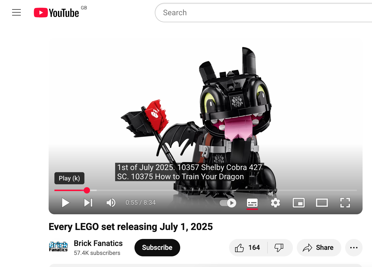 Videos should have closed captions for spoken content wherever possible to help those with hearing issues, this can also be useful in public spaces.
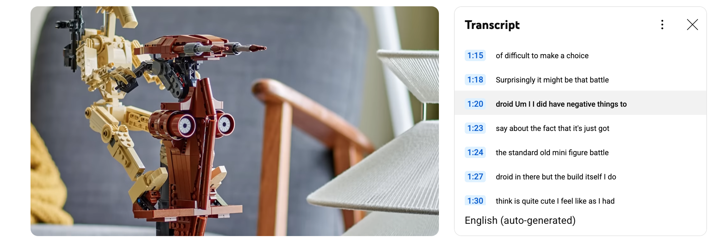 Content can also be transcribed. This example shows a transcription next to a video.
Operable#
‘Operable’ focuses on the usability of the site and mandates that users can navigate your design with different technologies.
Here are some things you can do to make your design operable:
- Don’t rely on a mouse or a trackpad
- Keyboard navigation - Users can navigate and interact with all elements using only the Tab, Enter, Arrow, and Spacebar keys
- Screen readers - They read out the content but it must be built properly
- Use visible focus indicators (outlines showing which element is selected)
- Have clear navigation that is consistent (have a focus order)
- Include “Skip to Content” links so keyboard users can bypass menus
- Allow for enough time to complete a task
- Avoid seizure-inducing content
- Don’t use content that flashes more than three times per second
- Ensure inputs are easy to use
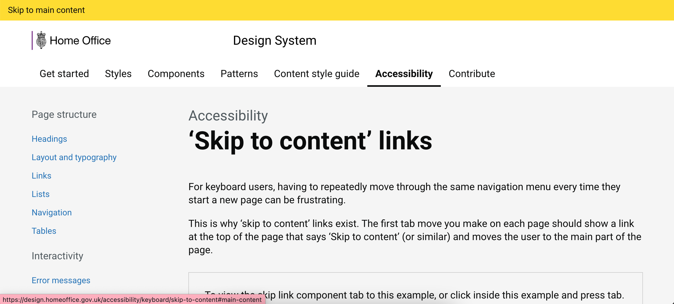 This is an example of a skip link, keyboard users can bypass the menu by pressing ‘tab’.
 Focused elements must be indicated so users know where they are. Here the GDS use yellow, but blue rings are often used.
Understandable#
‘Understandable’ is about clarity; it is important to keep language simple, create intuitive designs, and provide helpful error messages that guide users.
- Make text readable and comprehensible
- The average reading level in the UK is estimated to be typical of a child in UK education at 9 years old
- Use consistent and meaningful copy
- Provide definitions and context where needed
- Help users avoid and correct mistakes
- Pages and components should have consistent behavior
- Use existing behaviors where necessary and keep them consistent
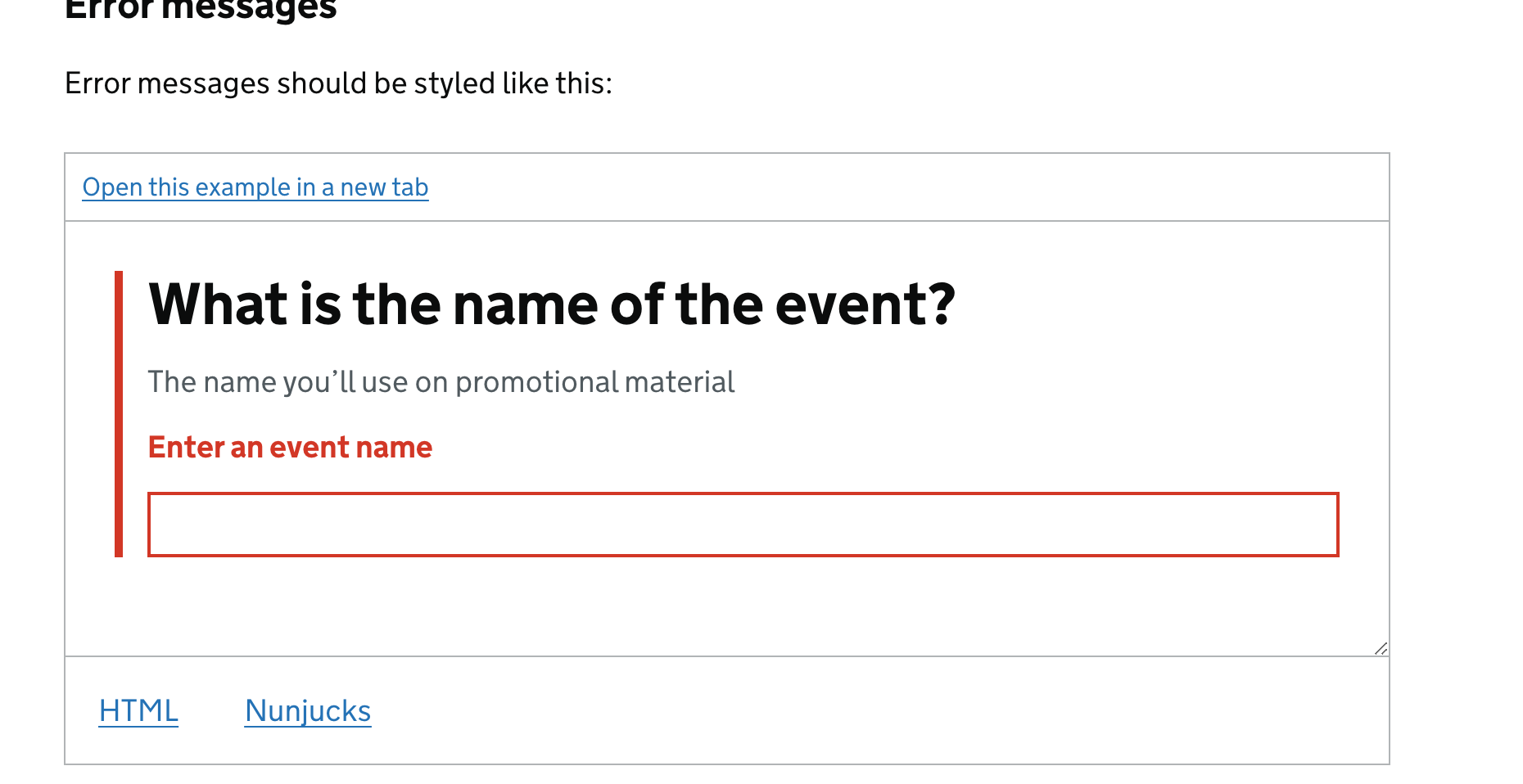 In this example by the GDS, the language is simple and plain. Error messaging is next to the affected area to provide context, and offers guidance on how to correct the issue.
“Our digital products are littered with dead ends, meaningless error codes, decipherable only to developers, and infuriating whimsy that leave our users frustrated and stuck.”
Amy Hupe - How to write error messages that actually help users rather than frustrate them
This is from a great post by Amy Hupe, where she goes into how we can write meaningful error messaging to guide our users and reduce frustration.
Robust#
‘Robust’ is a little more technical, it is intended to ensure your designs are built to work reliably for a wide range of users of assistive technologies like screen readers, braille displays, and voice control.
It also means your code should be clean, semantic, and standards-compliant, so it remains functional as technology evolves.
- Ensure content works on different devices
- Use ARIA (Accessible Rich Internet Applications) roles and properties only when native HTML doesn’t suffice
- Ensure content works with assistive technologies
- Important to test on assistive technologies
- Follow standard coding practices and stay up-to-date
⋆˚。⋆୨୧˚Thank you for reading my post ˚୨୧⋆。˚⋆